Picture this: you’ve just brewed your third cup of coffee for the day, you’re fired up with vision, and your business dream is this close to launching. There’s just one tiny hiccup… your logo was made in Microsoft Word (no shade, just facts), and your “brand” is really just your favourite colour and whatever font Canva had first.
Sound familiar?

If you’re a small business owner, side-hustler, or solopreneur, let me gently-but-firmly say this: your brand visuals matter more than you might think. It’s not just about being “aesthetically pleasing” (though we do love a good swoon-worthy logo)- it’s about communicating clearly, connecting emotionally, and showing up with consistency and confidence.
Let’s unpack why, shall we?
🌻 First Impressions Are Visual
Before someone reads your post, buys your product, or books your service, they see you. That first glance – your logo, your Instagram feed, your website homepage – it’s your digital handshake.
A logo is more than just a pretty mark; it’s a visual promise. It tells your audience who you are, what you value, and whether or not you’re worth their time.
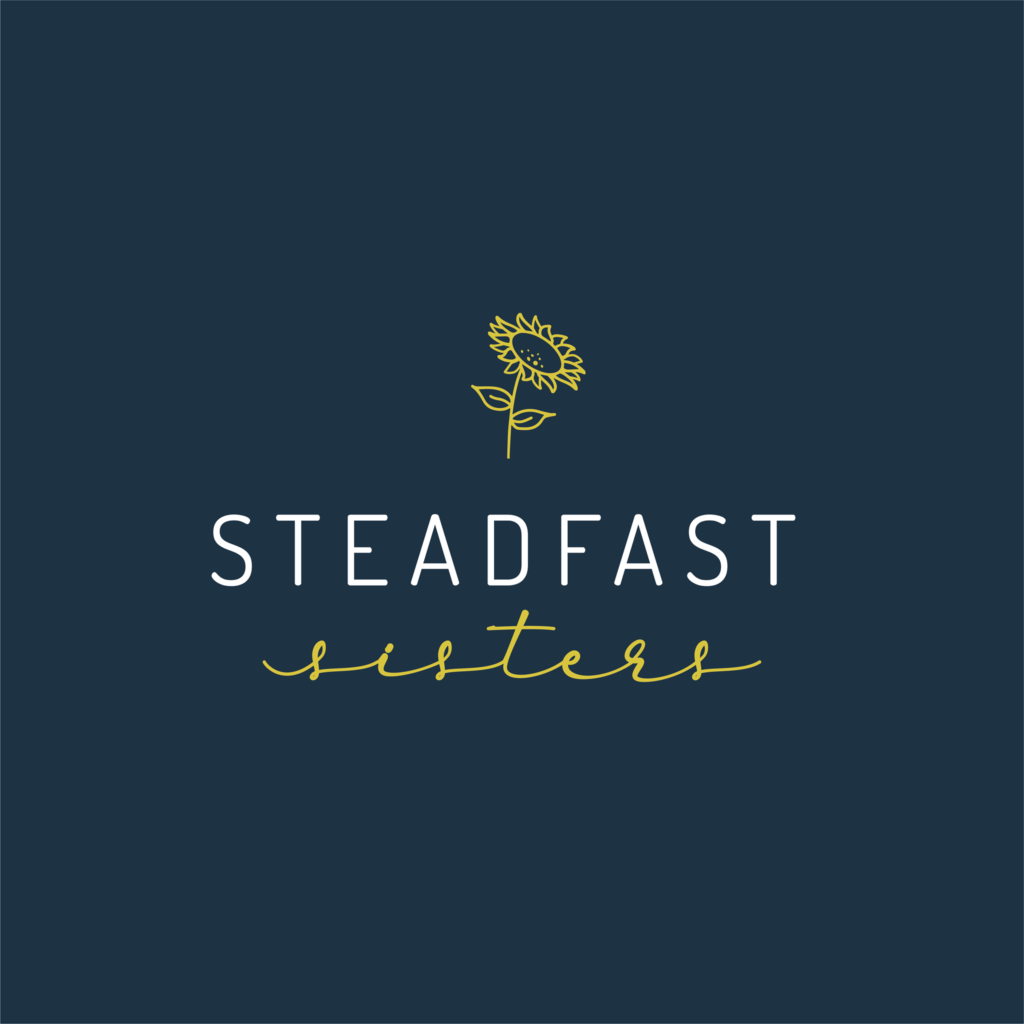
Take Steadfast Sisters, for example. Two powerhouse women with a heart for community, prayer, and deep chats over coffee. Their brand needed to feel warm, faith-filled, and deeply feminine, without veering into cliché. The solution? A sunflower-inspired logo using minimalist linework, a strong-yet-soft font combo, and a color palette of navy and yellow to balance boldness with warmth. Instantly recognizable. Instantly “them.”

That’s the power of visual identity done well.
🎯 Clarity Over Chaos
When your visuals are clear and consistent, your audience knows what to expect from you. It builds trust, subconsciously and quickly. If your logo says “playful” but your content is super corporate, there’s a disconnect. And disconnects confuse people. Confused people don’t convert.
Effective branding aligns your visuals with your values. It’s not about following trends – it’s about telling the truth of your brand through color, shape, type, and tone..
🧩 Every Piece Should Feel Like It Belongs
our brand isn’t just your logo. It’s your social posts, your packaging, your emails, your event flyers, even the tone of your captions. All of it is telling a story – and ideally, the same one.
When we designed for Steadfast Sisters, every piece – from their social templates to their event signage – was tailored to feel unmistakably like them. The result? A community that could rally behind a mission and recognize it in an instant, whether on Instagram or at an event booth.
💡 So, What Makes a Logo Effective?
Here’s a quick checklist to see if your logo is doing its job:
- Is it memorable? (Could someone sketch it from memory?)
- Is it versatile? (Does it work in black and white, tiny sizes, or on different backgrounds?)
- Is it reflective? (Does it match your mission, voice, and audience?)
- Is it clean? (Cluttered = confusing. Simple wins.)
If you’re unsure, here’s your gentle nudge to get some expert eyes on it. A well-crafted logo is an investment with compound interest, it keeps showing up for you.
🎉 You’re Not “Just” a Small Business
You’re a dream-builder. A creative. A solution-bringer. Whether you’re launching a side hustle or scaling a full-on movement, your visuals deserve to reflect the heart behind your hustle.
Because branding isn’t just how you look – it’s how people feel when they encounter you.
So if your current logo feels a bit “meh”… maybe it’s time for a glow-up.

Your audience is ready to see you. Let’s make sure they really see you.
